
TENDENZA MODA A/I 2020-21: I COLORI (parte 2)

-ITA-
Da New York a
Londra, Milano e Parigi, le passerelle di questo autunno inverno sono state più ricche che mai di
ispirazioni, portando alla luce una miriade di nuovi stili e sfumature da
indossare per tutti gli appassionati di moda.
Allora, quali sono i trend
colore del prossimo inverno?
Dall'iconica collezione super colorata di Ralph & Russo ai pezzi interamente in lattice di Saint Laurent, ecco la seconda parte delle tendenze moda colore F / W 2020-21
Verdi e gialli
-
Verde
oltremare
Questo tono blu-verde profondo e vivido è di classe ma anche sorprendente: Pantone lo descrive come un colore che emana "sicurezza di sé e compostezza" ed è sicuramente un colore che rivela molta raffinatezza ma anche un pò di audacia. - Green
Sheen
Questo giallo acido è stato uno dei colori più vivaci delle passerelle dell'autunno/inverno 2020-21. È un colore caldo e moderno che si è davvero distinto tra tutti i colori terrosi ed i blu di questa stagione. - Sedano
Leggermente meno intenso del suo fratello più incline all'acido, il verde sedano è anch’esso un giallo-verdastro, anche se appare più strettamente correlato al mondo vegetale. Questo è uno dei colori autunno/inverno 2020-21 più delicati e di cui vale la pena diventare fan. - Verde
Oliva
Questo verde oliva militare, è un semi –neutro che ha decisamente conquistato le passerelle. E’ un colore forte e indossarlo aggiungerà facilmente un tocco di stile ad ogni outfit. - Verde
pera
Vivace, pieno e fresco, il verde pera si trova a metà strada tra l'oliva militare ed un verde brillante, creando una delle tendenze cromatiche più originali dell'autunno / inverno 2020-2021. Potrebbe sembrare più appropriato per l'estate, ma il verde pera riesce ad illuminare anche le più cupe giornate invernali.
Neutri
-
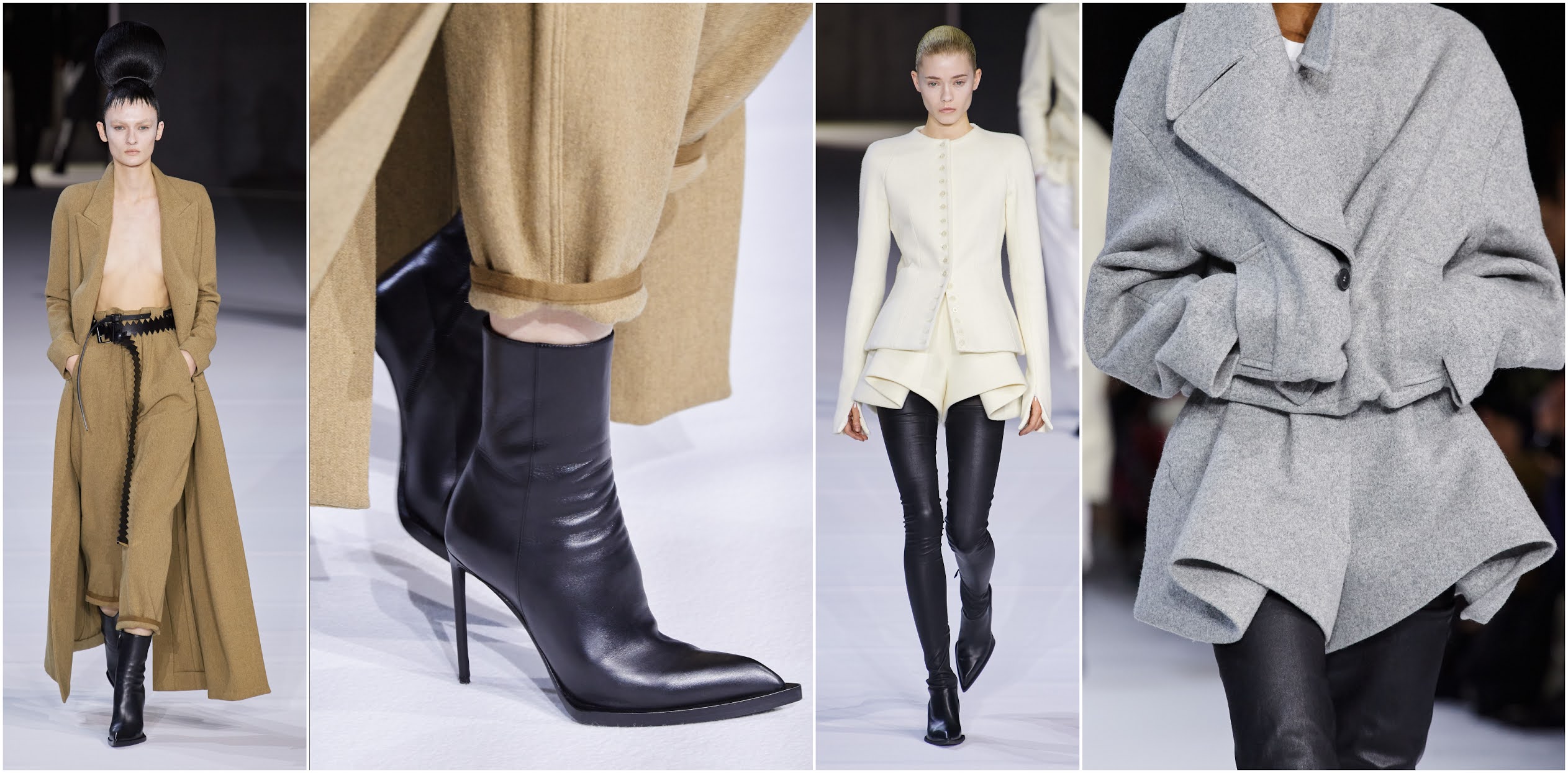
Montone
Vellutato e morbido, il color montone è un pallido color cammello rosato che rientra senza dubbio tra le tendenze cromatiche neutre dell'autunno inverno 2020-21. Questo colore è delicato e morbido, ricorda il cashmere lussuoso, sebbene abbia anche un che che ricorda il raso. - Sabbia
Calda e terrosa, questa deliziosa tonalità dona alle tendenze cromatiche dell'autunno / inverno 2020-21 un po 'di confortante leggerezza. È una sfumatura delicata che volerebbe basso in una collezione primaverile, ma per le stagioni fredde finisce per essere piuttosto d'impatto. - Tawny Birch
Questa tonalità rosata è quasi neutra, e si divide tra una sensazione legnosa e un'energia femminile. In linea generale questo colore risulta confortevole, rendendolo una bella aggiunta alle tendenze cromatiche dell'autunno 2020. - Toffee
Il toffee è un marrone ricco e caldo, una sorta di variazione più profonda del montone che si adatta perfettamente alla stagione fredda. Questo neutro è particolarmente apprezzato per la pelletteria, come sui cappotti oversize di Boss oStella McCartney. - Ghiaccio
Il grigio vincente per la stagione è una variazione chiara che tende leggermente verso il freddo, che funziona con tutti gli altri colori freddi della stagione. È una tonalità davvero senza tempo, quindi qualsiasi cosa prenderete in questo colore sarà ancora chic anche tra decenni. - Grigio
asfalto
Se preferite colori più scuri, potreste amare il grigio asfalto, che è più profondo del ghiaccio con un tono un po’ più dark. Come per la tonalità di grigio più morbida, anche questo grigio è molto popolare per cappotti e mantelle. - Jet
Stream
Non c’è stato spazio per i bianchi puri nelle tendenze dei colori dell'autunno / inverno 2020-21. Tuttavia, il jet stream, una sfumatura biancastra di grigio, era onnipresente. - Olio
di mandorle
L'olio di mandorle è la seconda tonalità biancastra che ha conquistato le passerelle, ma a differenza del jet stream, tende verso tonalità calde. E’ una sfumatura naturale, morbida e piena che sembra vagamente burrosa. - Nero
Forse è banale parlare del nero come una tendenza colore dell'autunno/ inverno 2020-21 dato che il nero è un vero must sempre di moda, ma c'era così tanto nero sulle passerelle di questa stagione che non si può proprio ignorarlo.
-ENG-
From New York to London, Milan and Paris,
the runways were as rich as ever, bringing forth a myriad of new styles and
shades to be worn by avid fashion followers ASAP.
So what’s trending this
coming winter?
From Ralph & Russo’s iconic colorful collection to Saint Laurent’s all-latex pieces, here is the second part of the F/W 2020-21 color fashion trends
Greens and Yellows
- Ultramarine Green
- This deep, vivid blue-green tone is classy but striking – Pantone describes it as exuding “self-assurance and poise,” it’s a color with a lot of sophistication and a bit of a daring streak.
- Green Sheen
- This loud, acid-yellow was one of the most vivid fall winter 2020-21 runway colors. It’s a warm, hungry color that really stood out against all the earthy and blue colors from this season.
- Celery
- Slightly less intense than its acid-leaning sibling, celery is also a greenish-yellow, albeit one that seems more closely related to the plant world. This is one of the more delicate fall/winter 2020-21 colors, and to became definitely fan of.
- Military Olive
- Military olive is a semi-neutral that absolutely will win you overWearing it will absolutely add a bit of weight to your step.
- Pear Green
- Vibrant, juicy and healthy, pear green stands somewhere between military olive and green sheen, making one of the brightest fall/ winter 2020-2021 color trends from the runways. It may be more appropriate for the summertime, yet pear green comes to brighten up your gloomy fall days.
Neutrals
- Sheepskin
- Fleecy and soft, sheepskin is a pale pinkish-camel hue that counted as one of the neutral fall 2020 color trends. This color is delicate and soft, bringing to mind luxurious cashmere or cozy fleece, though it also gives off an innocent touch in satin.
- Sandstone
- Warm and sandy, this lovely shade injects the fall/ winter 2020-21 color trends with a bit of comforting lightness. It’s a gentle shade that would fly under the radar in a spring collection, but for the cold seasons, it ends up being quite impactful.
- Tawny Birch
- This rosy tan shade is very nearly neutral, with a woodsy feel but distinct feminine energy. This color feels cozy, making it a great addition to the fall winter 2020 -21 color trends.
- Toffee
- Toffee is a rich and warm brown, like a deeper variation on sheepskin that is a perfect fit for any cold season. This fantastic neutral was especially popular for leather, like an oversized coat at Boss and at Stella McCartney.
- Sleet
- The winning gray for the season is a light-colored variation that leans very slightly towards cool, so it will work with all the other cool colors from the season. It’s a truly timeless shade, so any item you pick up this season in this color will still look chic even in a few decades.
- Asphalt Gray
- If you prefer darker colors, you might love asphalt gray, which is deeper than sleet with a bit of a wicked streak. As with the softer gray shade, this darker gray was also very popular for coats and capes.
- Jet Stream
- There was no room for pure, stark whites in the fall/ winter 2020-21 color trends. However, jet stream, a gray-tinged off-white shade was extremely ubiquitous.
- Almond Oil
- Almond oil was the second off-white shade to take over the runways, but unlike jet stream, it leans towards warm. It’s tasteful and tasty, a natural, soft, and appetizing shade that feels buttery, but since it’s almond-inspired, it’s also totally vegan.
- Black
- Maybe it’s cheating to talk about black like it’s a fall/winter 2020-21 color trend because black is a true ever-fashionable staple, but there was just so much black on the runways this season that you couldn’t ignore it, and not just from usually black-loving labels like Saint Laurent, but also from designers that usually give us a lot of colors.


CREDITS: VOGUE.IT

sto leggendo il libro dedicato all'armocromia per conoscere quali colori sono più adatti a me..queste tonalità pantone però sono effettivamente molto belle..baci
RispondiEliminaInteresting post my dear, thank you for sharing )
RispondiEliminaHi,
RispondiEliminaI don't like this Pantone color palette oh !! I think I prefer neutrals! This is what I think, but then trends come out and I change my mind ahahah I think !!
xoxo
marisasclosetblog.com
Ma sai che molti capi li indosserei, sarà che maxi cappotti e blazer hanno il mio cuore...ovviamente le tue spiegazioni a lettere e poi in immagini sono sempre assolutamente perfette
RispondiEliminaoh my gosh! all the looks look perfect! i fell in love with the black outfits, soemtimes similar would appreciate wearing:)
RispondiEliminawww.melissahartford.blogspot.com
Melissa Hartford | lifestyle & fashion blogger
Instagram
Very fine outfits ;)
RispondiEliminaThis is very informative. Always great to know what's on trend.
RispondiEliminawww.sophieatieno.com
Io quest'anno volevo puntare più sui verdi che sui neutri e invece ho l'armadio pieno di neutri e nessun capo verde!!!
RispondiEliminaDon't Call Me Fashion Blogger
Facebook
Bloglovin'
Hey very good Silvia!
RispondiEliminaI really liked that this time you tackled the trends of the season but now from the point of view of colors. As a graphic designer and illustrator I find it really interesting, since a color could really determine the allure of a piece or the voice of an entire collection.... sometimes this is a decision that could ruin a whole collection if you go for an obvious combination.
I have seen that right now designers are beating for presenting the things with an unexpected color palettes. For example the suits in more soft or bright colors and leaving the neutrals or darker tones for other pieces that could work as accessories. I also liked some of the looks you shared with us cause many are using block colors or bold options, not gradients or many complicated patterns, they are beating on the color as the main protagonist of the piece and obviously patterns and silhouettes!
Gonna check the first one of this post! Congrats on this really interesting post!
Pablo
Hey Fungi
Bellissimi questi colori e tonalita'.
RispondiElimina